


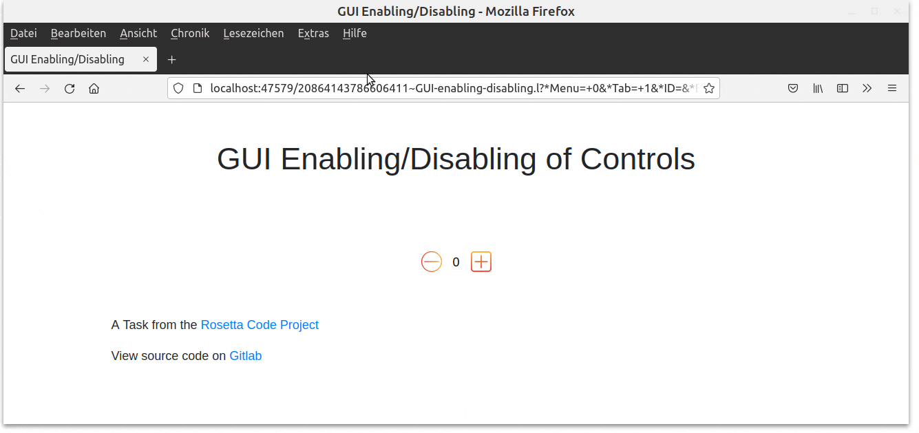
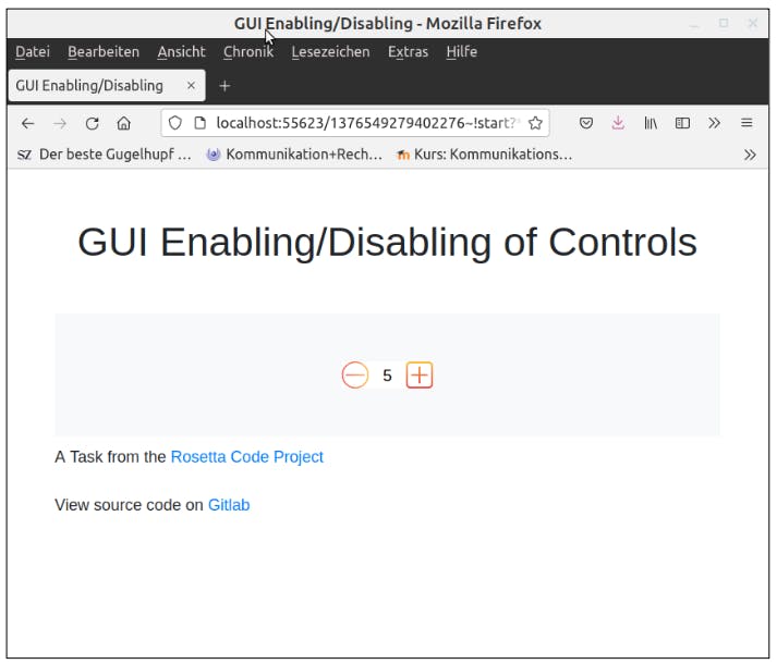
Task
Similar to the task [GUI component interaction], write a program that presents a form with three components to the user:
- a numeric input field ("Value")
- a button ("increment")
- a button ("decrement")
The field is initialized to zero. The user may manually enter a new value into the field, increment its value with the "increment" button, or decrement the value with the "decrement" button.
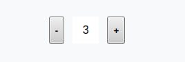
The input field should be enabled only when its value is zero. The "increment" button only as long as the field's value is less then 10: When the value 10 is reached, the button should go into a disabled state. Analogously, the "decrement" button should be enabled only as long as the value is greater than zero.
Effectively, the user can now either increment up to 10, or down to zero. Manually entering values outside that range is still legal, but the buttons should reflect that and enable/disable accordingly.
In the end, it will look like this:
You can view the hosted version here.
Again, this kind of builds up on the previous task. So let's leave the frame as it is and just modify the components inside.
Defining the GUI elements
We can re-use our previous design. Let's put the decrement-button to the left and the increment-button to the right side and make the Number-field a little bit smaller.
(gui '(+JS +Style +Button) "mx-1 p-2" "-" '(dec '*Count))
(gui '(+Var +Style +NumField) '*Count "mx-2 text-center" 2)
(gui '(+JS +Style +Button) "mx-1 p-2" "+" '(inc '*Count))
The +Able Prefix Class
In the post about prefix classes, we have already seen that we can use the +Able class to enable or disable components. +Able takes a function that enables the component if it evaluates to non-NIL.
We should only be able to increment if the *Count variable is less than 10. That's easy:
(gui '(+Able +JS +Style +Button) '(> 10 *Count) "mx-1 p-2" "+" '(inc '*Count))
and vice versa only be able to decrement if it's greater than 10.
(gui '(+Able +JS +Style +Button) '(gt0 *Count) "mx-1 p-2" "-" '(dec '*Count))
Change the button design
Because it was so easy, let's replace our buttons with some icons (just for fun). I downloaded them from flaticon.com/free-icon/add_1102342 (credits in the Sources).
The syntax to use a button image instead of name tag is as follows: T <file>. I placed the icons into a subfolder img.
(gui '(+ ... +Button) T "img/minus.png" '(dec '*Count))
However, the test reveals that the button is much too large, it fills up the whole screen. So we need to define a css-class specifically for these buttons.
Let's create a new file custom.css and place our icon specification inside:
.icon-style {
   height: 30px;
   width: 30px;
}
Then we need to reference our css-file in the global *Css variable,
(setq *Css '("@lib.css" "css/bootstrap.css" "css/icons.css"))
and pass the icon-style class to our button element.
(gui '(+ ... +Style +Button) "icon-style" T "icons/minus.png" '(inc '*Count))
Now we get two colorful icons that can be used as incrementing and decrementing buttons.
The final source code can be downloaded here.
Sources
rosettacode.org/wiki/GUI_enabling/disabling..